Brand identity & design system
One system behind every Jinba surface — the marks, the warm sand palette, serif headings over a precise grotesk, and the tokens that hold it all together. This page documents the system and ships the assets, so anything built on Jinba looks like Jinba.
Logo System
Three marks, one voice
Every core mark is a single-color SVG. In code it is driven by currentColor — one file takes whatever text color surrounds it, in light and dark.
The downloadable files ship with the brand brown baked in so they open ready
to place, plus PNG recolors for every surface.






Color
Two scales, one inversion
Fourteen stops per scale, defined in oklch. Dark mode is not a second palette — the scale flips, and every semantic token adapts automatically. Components never touch raw stops.
Sand
--sand-0 … 1000
Brand primary. A warm scale drawn from sand, clay, and roasted wood.
Top: light mode. Bottom: the same variables in dark mode.
Neutral
--neutral-0 … 1000
Same lightness curve as Sand with near-zero chroma and a slight warm undertone.
Top: light mode. Bottom: the same variables in dark mode.
Semantic tokens
The only color API components should use. Each token resolves to a scale stop and flips with the scale in dark mode.
| Token | Resolves to | Usage | Swatch |
|---|---|---|---|
| --background | sand-100 | Page background | |
| --background-raised | sand-50 | Cards, panels | |
| --background-inset | sand-75 | Wells, code blocks | |
| --background-sunken | sand-200 | Recessed areas | |
| --foreground | sand-900 | Primary text | |
| --foreground-muted | neutral-700 | Secondary text | |
| --foreground-subtle | neutral-500 | Captions, hints | |
| --border | neutral-200 | Default borders | |
| --border-strong | neutral-400 | Emphasized borders | |
| --jinba | sand-900 / sand-700 | Brand accent (light / dark) |
Product accents
Jinba Flow
--flow · #2C50B5
Jinba App
--app · #A22727
Jinba Toolbox
--toolbox · #7D95A1
Typography
Serif voice, grotesk body
Tiempos Text carries the headings at a single weight — regular. Geist handles body and interface text; Geist Mono handles code and data. Japanese headings switch to Zen Old Mincho.
Heading 1 · Tiempos Text 400 · 36 / 48px · tracking -0.025em · leading 1.22
Automation, in one motion
Heading 2 · Tiempos Text 400 · 30 / 36px · tracking -0.025em · leading 1.3
Automation, in one motion
Heading 3 · Tiempos Text 400 · 20 / 24px · tracking -0.015em · leading 1.3
Automation, in one motion
Japanese heading · Zen Old Mincho 400
人馬一体のワークフロー
Body · Geist 400 · 16px · leading 1.5
Jinba pairs people and AI the way rider and horse move together — each doing what it does best. The interface stays out of the way: quiet surfaces, warm neutrals, and typography that reads before it decorates.
Mono · Geist Mono 400 · 14px
const workflow = await jinba.flows.run("daily-digest");
| Token | Family | Foundry | Role | Notes |
|---|---|---|---|---|
| font-serif / font-heading | Tiempos Text | Klim Type Foundry | Headings, editorial | Weights 400–700 loaded. Use 400 only. |
| font-sans | Geist | Vercel | Body, UI | Variable font, self-hosted. |
| font-mono | Geist Mono | Vercel | Code, data, labels | Variable font, self-hosted. |
| font-serif-ja | Zen Old Mincho | Yoshimichi Ohira | Japanese headings | Weights 400 / 700 / 900. |
Textures
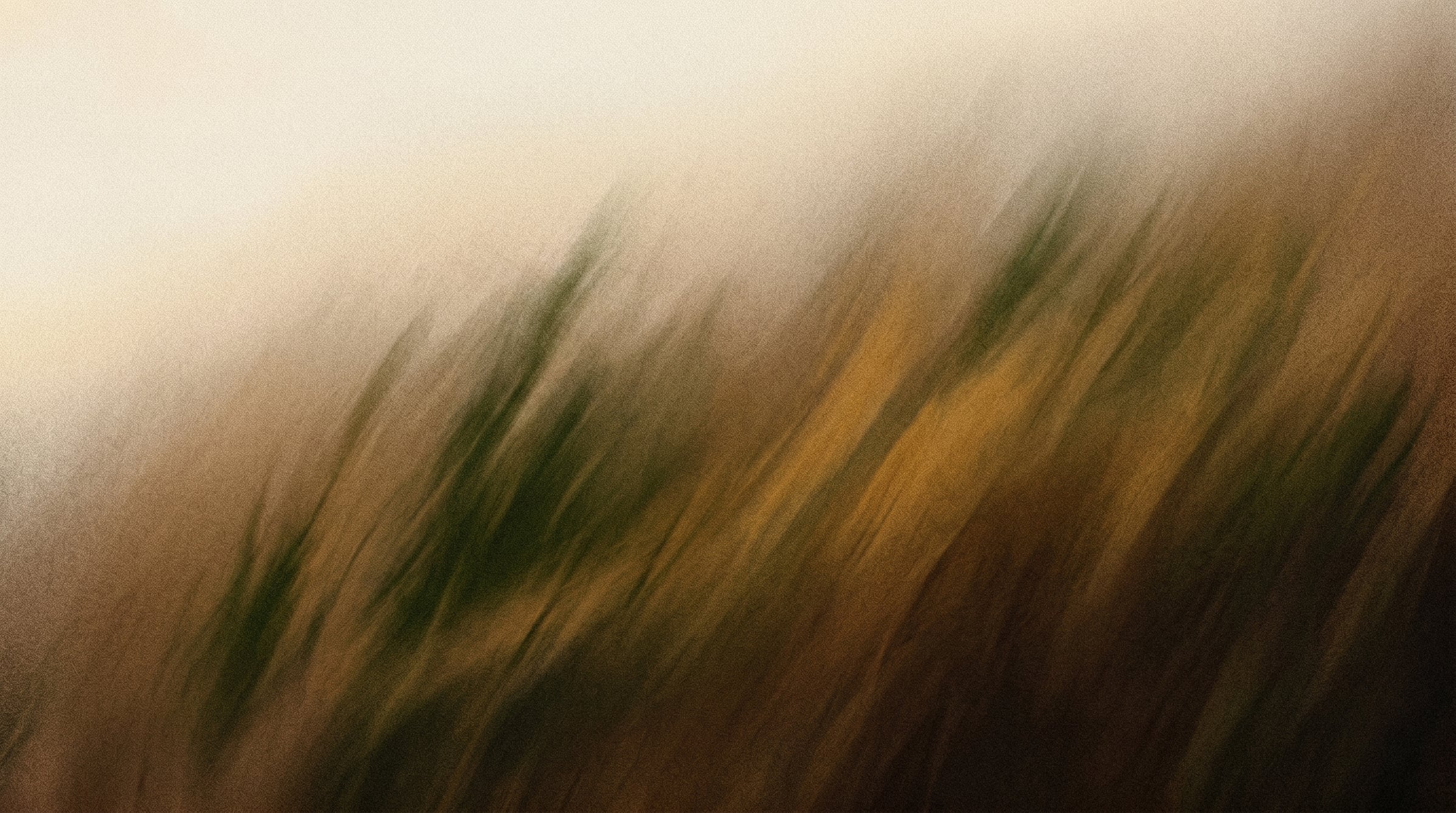
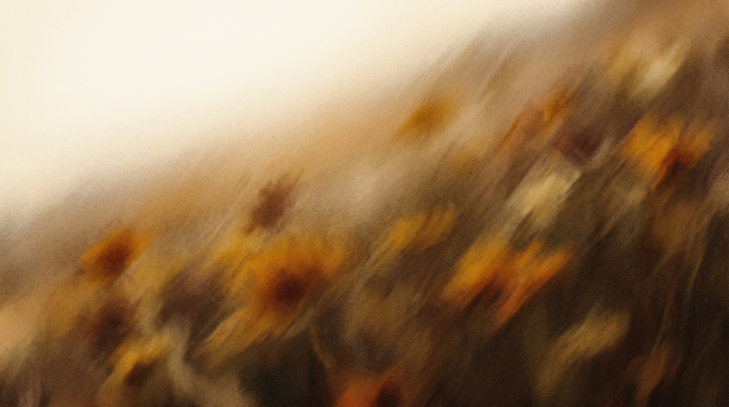
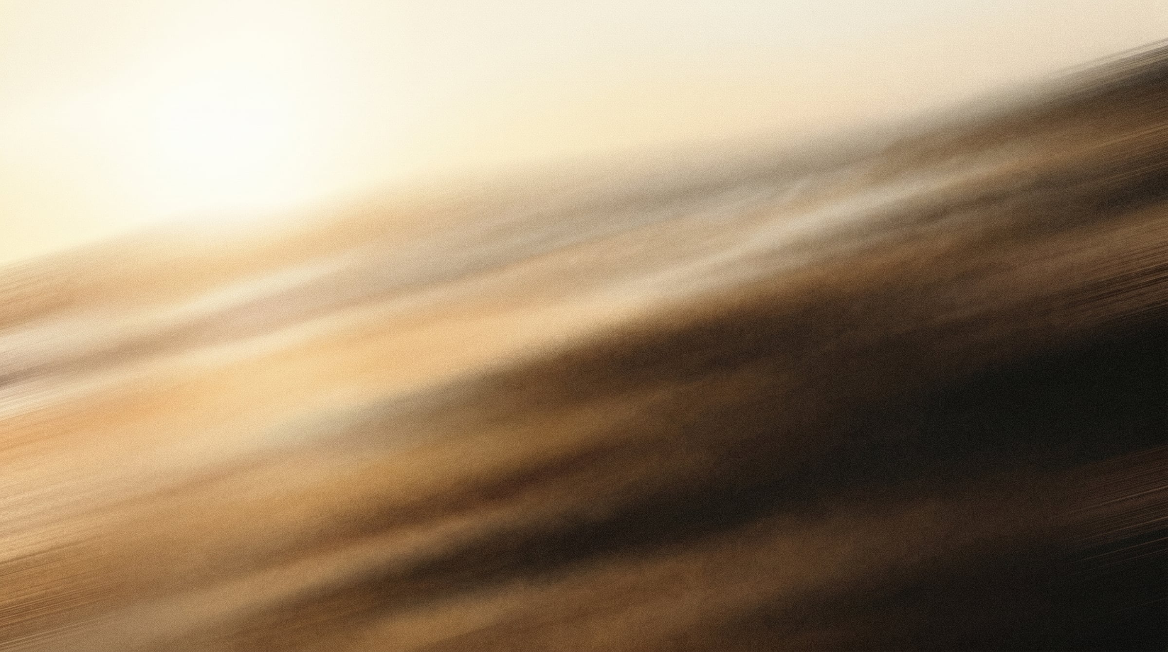
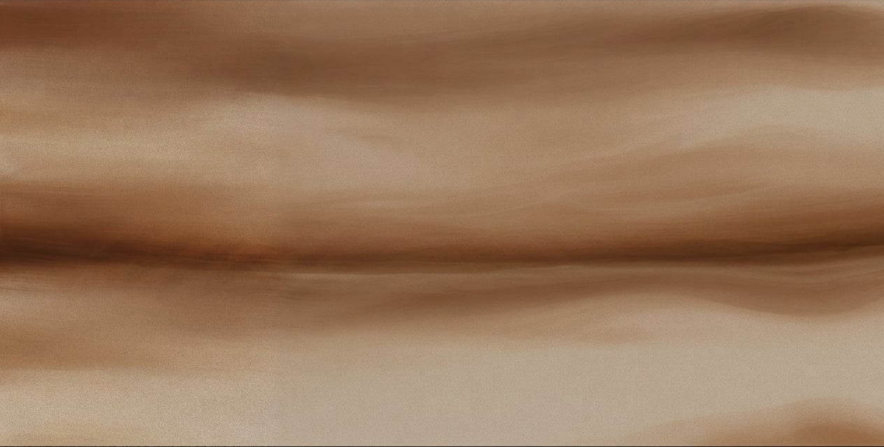
Texture library
Photographic and painted textures that give surfaces their warmth — use them sparingly, behind type or as section accents, never as decoration for its own sake.
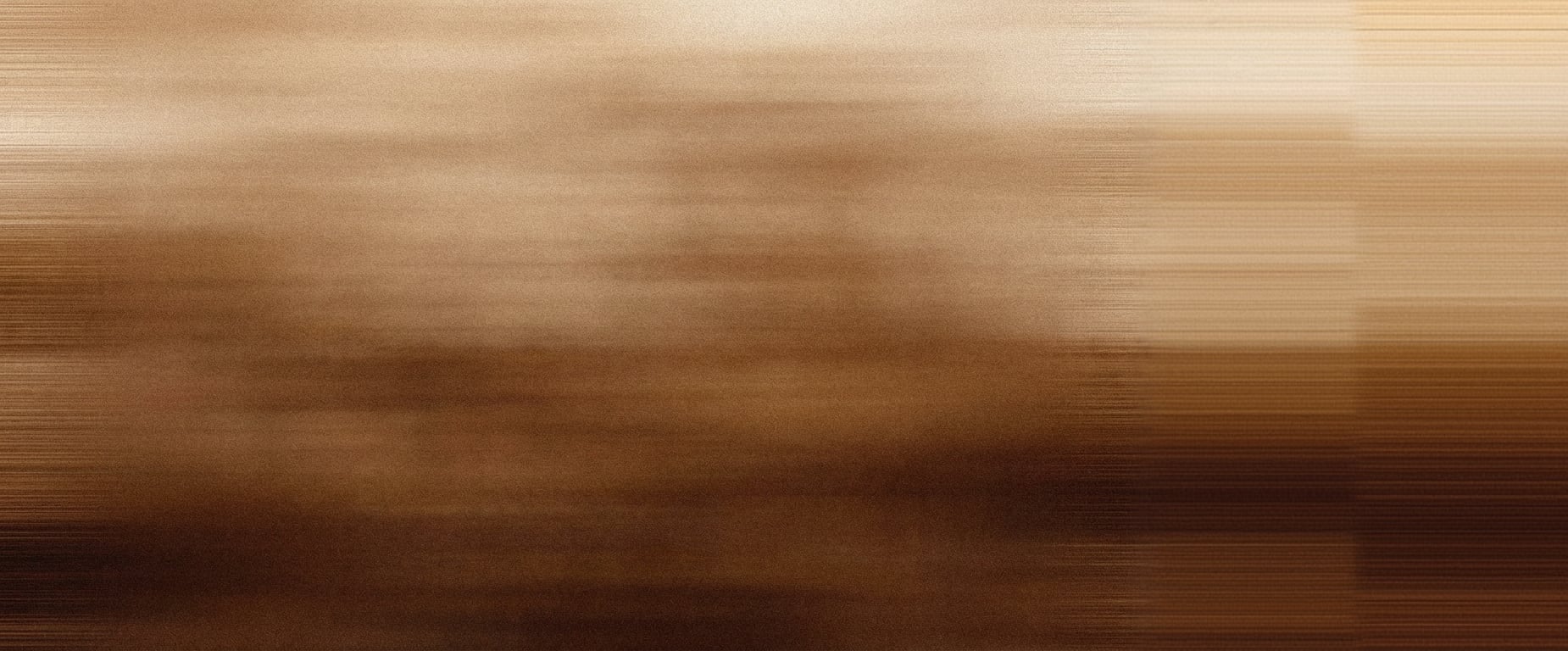
Field
Landscape fields — hero backdrops and section breaks.






















































Layout
One section primitive
Pages are stacks of Section components. Each section picks a container width; spacing between sections
is set once, globally.
container-prose ~65ch · Long-form reading container-sm 768px · Narrow content container-md 1024px · Standard content container-lg 1152px · Wide content container-xl 1200px · Default page container container-2xl 1440px · Full-bleed layouts Principles
How to stay on system
Reference semantic tokens (--background, --foreground) in components
Use raw scale values or hard-coded hex in components
Set logo color through currentColor with a text-* class
Recolor, stretch, or add effects to the logo
Use Tiempos Text at weight 400 for every heading
Use bold serif weights or override global heading sizes
Let dark mode come from the scale inversion — for free
Write per-component dark-mode color overrides
Design System
Built to be adopted
The system is live on this site. Bringing it to a new product — Flow, App, Toolbox, or your own surface — takes four steps. The architecture is plain CSS custom properties, so it composes with Radix Themes, Primer, Carbon, or any token-based system.
Copy the style files
scales.css (color scales + dark inversions), tokens.css (semantic tokens), and theme.css (Tailwind wiring) are the entire color system. Copy them in unchanged.
Load the fonts
Self-host Geist and Geist Mono via @fontsource, Zen Old Mincho for Japanese, and Tiempos Text from licensed woff2 files. No CDN calls.
Apply heading defaults
Headings are styled globally — serif family, weight 400, tight tracking, fixed line-heights. Components use bare h1–h3 and inherit.
Wire up Tailwind
theme.css registers every scale stop and semantic token as a Tailwind utility: bg-background, text-foreground-muted, border-border, bg-sand-200.
/* Components speak tokens — never raw values */
.card {
  background: var(--background-raised);
  color: var(--foreground);
  border: 1px solid var(--border);
}

/* Dark mode is already handled — the scales invert underneath */
Roadmap: @jinba/design-system
The tokens, scales, fonts, and logo components documented here are headed for a published npm package, so every Jinba product — and products built on Jinba — can adopt the system with one install instead of copied files.